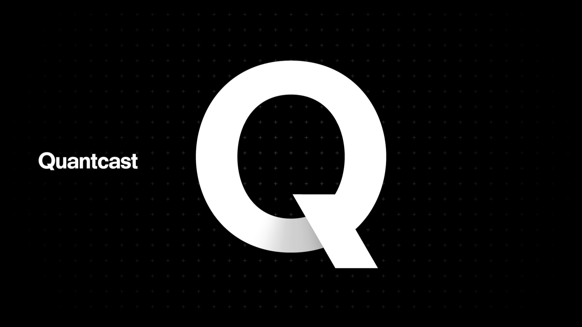
Quantcast
Since 2006 Quantcast has been building the world’s largest AI-driven audience behavior platform for the open Internet. Unfortunately the brand’s identity had not evolved since their early days.
The brand was stuck in a paradox; the brand’s identity did not match the complexity and power of its technology — the existing visual language was downplaying the value of their products.
We partnered with Redscout to redefine and reimagine the brand system, into one that did justice to nearly two decades of innovation.


Brand Principles
Creativity fuels growth. At Quantcast we believe in the power of data to unlock this creativity for brands. We aim to strike the perfect balance between art and science by turning the abstract into action and simplifying complexity. The value of our data does not stem from the size of the set but by our ability to extrapolate insights and patterns. Driven by integrity and principle, we do more with our data to solve the problems around us. We call the sum of these values Distilled Intelligence.

The Plus Sign System
The plus mark visualizes our ambition to fuel growth. The plus pattern is inspired by the metaphor of Quantcast as both a layer over the internet and a force of growth. The pattern provides an organizing principle across all materials.


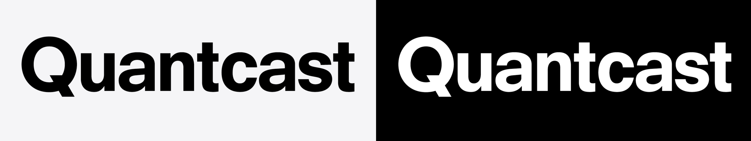
Typography
Neuzeit Grotesk, a geometric sans-serif first designed in 1928 for the Stempel Type Foundry, epitomizes the Bauhaus principle of form following function. Known as a hard working typeface, the high-legibility letterforms connote purity, sophistication, and timelessness.

Color
Our color palette captures the power of art & science. Quantcast is the science, an empirical lens of black and white, that reveals a spectrum of insight. We see data in color. This artistry is not without rigor; our palette is derived from the mathematics of color theory.


more WORK